


Keyboard Editor
The keyboard editor is the heart of Keyman Developer. This window allows you to edit all aspects of a keyboard layout, from the visual layout of the keyboard, to logic rules, to touch interactions, and more.
The editor is divided into multiple tabs. Initially, only three tabs will be visible: Details, Layout, and Build. A keyboard can have multiple source files, which are all managed within this one editor.
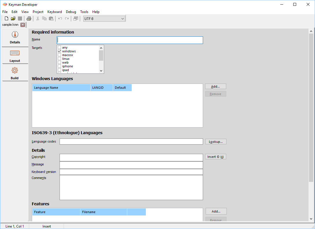
The following image shows the first tab of the editor, the Details tab, for a brand new keyboard, with those three initial tabs.
Keyboard component files
A keyboard contains multiple source files. The following table lists the file types and which tabs are used to edit them. The filenames shown are defaults and can be modified, by editing the corresponding line in the source file (and renaming the file). However, where possible the default names should be used.
| File type | Tabs | Feature | Store name | Description |
|---|---|---|---|---|
file.kmn |
Details, Layout | The primary keyboard source file. Required. | ||
file.kvks |
On-Screen | Desktop On Screen Keyboard | &visualkeyboard |
The visual presentation of the keyboard for desktop computers. |
file.ico, file.bmp |
Icon | Icon | &bitmap |
An icon that represents the keyboard in the user interface on desktop computers. |
file.keyman-touch-layout |
Touch Layout | Touch-Optimised Keyboard | &layoutfile |
The touch layout visual description file |
file-code.js |
Embedded JS | Embedded Javascript | &kmw_embedjs |
Additional Javascript code for IMX functionality |
file.css |
Embedded CSS | Embedded CSS | &kmw_embedcss |
Additional CSS stylesheet for custom touch and web layout styling |
file-help.htm |
Web Help | Web Help | &kmw_helpfile |
HTML file that replaces the On Screen Keyboard on desktop web layouts |
file-codes.txt |
Include Codes | Include Codes | &includecodes |
Code dictionary for use with named constants |
Three tabs include both visual and code editors: the Layout, Touch Layout and JSON Metadata tabs. Changes to one view will be immediately reflected in the other view. The code in the Layout tab is important because that reflects both the Details and the Layout tab.
Details tab
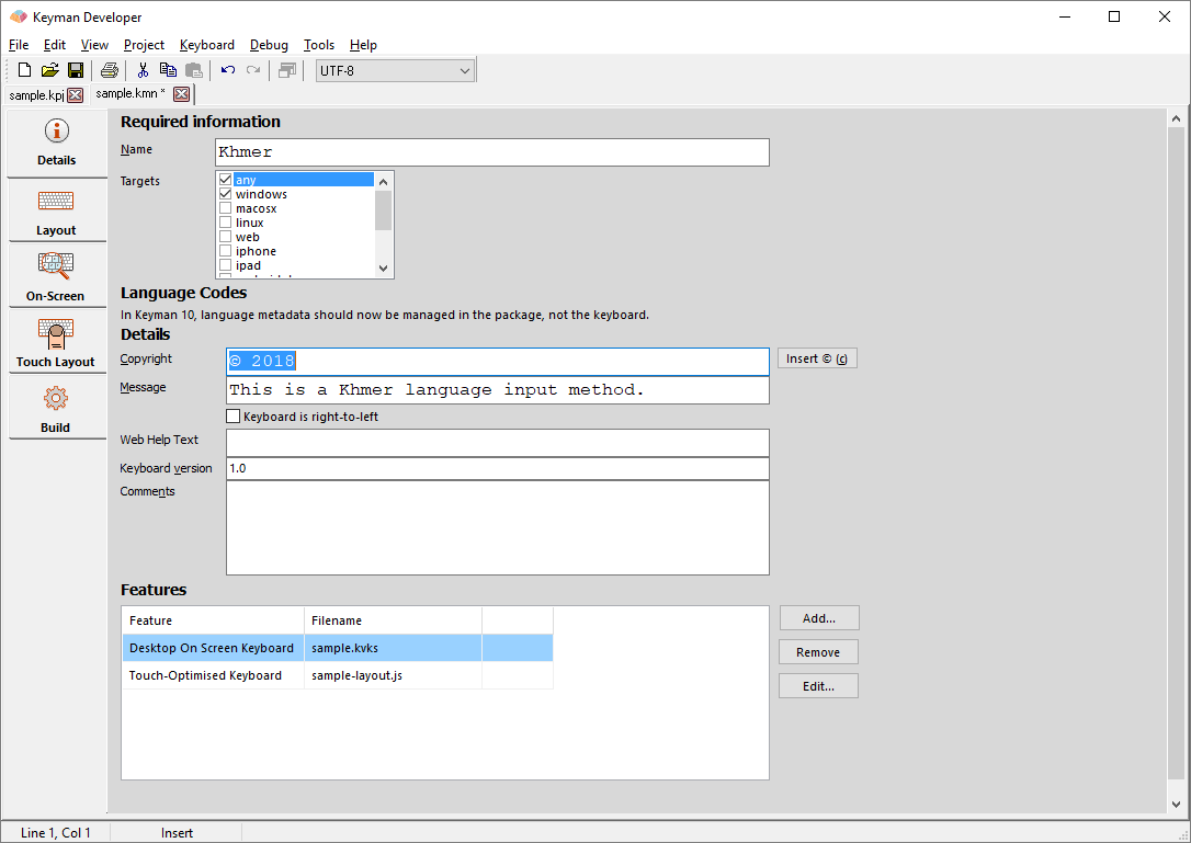
The Details tab grows as you add more options to a keyboard. The fields here are:
- Name
- The name of the keyboard, corresponding to the
&namestore. - Targets
- The intended target devices and operating systems, corresponding to the
&targetsstore. Changing the targets will hide or show parts of the Details and Compile tabs. If no targets are selected, Keyman Developer will treat the keyboard as a Windows-only keyboard, for backward compatibility reasons. - Copyright
- Enter the details of the copyright owner for the keyboard.
©rightstore. - Message
- Enter a message that will be shown at install time for the keyboard (on Windows, macOS).
&messagestore. - Keyboard is right-to-left
- Check this box to indicate that the keyboard is a right-to-left keyboard, for web and touch layouts.
&kmw_rtlstore. - Web Help Text
- A single line of text, with basic HTML allowed, shown at the bottom of the desktop web On Screen Keyboard.
&kmw_helptextstore. - Keyboard version
- The version of the keyboard. Read the reference documentation for
&keyboardversionstore to understand the legal values for this field. This is not the same as the&versionstore, which controls the Keyman (and Keyman Developer) version for which a keyboard is designed. - Comments
- This field corresponds to the first lines of comments in the keyboard source, and is visible only to the keyboard designer.
- Features
- The Features grid controls which additional file components are included in the keyboard, as listed in the Component Files section above. Each of the features relates to a system store. Adding a feature will add an extra tab to the editor, and add the corresponding store to the keyboard source. Removing a feature will not delete the component file, but will just remove the store from the keyboard source.
Layout tab
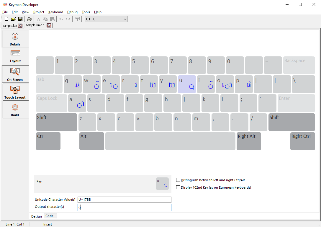
The Layout tab gives you a simple interface to quickly create a keyboard using a visual representation of a desktop/laptop computer keyboard. You can drag and drop characters from the character map to create keyboard layouts. You cannot access most of Keyman's more powerful features from the Layout Design view, but it will be useful to get you started on your design.
Each key can have zero or more characters assigned to it. Each key can be assigned a different set of characters for each shift state. You can change the shift state by clicking on the Shift, Ctrl, and Alt keys.
There are two ways to assign characters to the keys:
- Click on a key, and then type the character's code into the Unicode Character Value(s) field, or the type/paste the character itself into the Output character(s) field.
- Select the character from the Character Map and drag and drop it onto the appropriate key. This will set the key to output that character.
Note that any key that does not have a character assigned to it will output what the selected Windows layout specifies.
- Distinguish between left and right Ctrl/Alt
- A Keyman keyboard can treat left and right Ctrl and Alt identically, or it can distinguish between them. The Design view allows one or the other mode (in Code view, you can use both interchangeably).
- Display 102nd Key (as on European keyboards)
- European keyboards have one extra key that is not on US keyboards. This key is positioned to the right of the left shift key. Some other keyboards have additional keys; these are not shown on the layout designer. If you have a European layout selected as your Windows layout, the 102nd key will always be visible in the designer. When a European layout is selected as your Windows layout, the shape of the Enter key will also change to take two rows, and the backslash key will move down one row, but not otherwise change in behaviour.
You can press and release Ctrl to select another key on the keyboard using your keyboard.
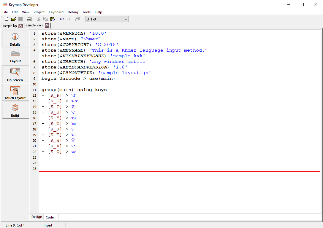
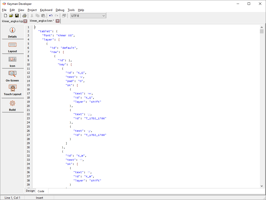
The Code view shows the source code of the keyboard file. This is where all the information in the Details and Layout tab is stored, and additional logic and complex keyboard layouts will be edited entirely in the Code view.
See the Editor topic for more information on how to use the editor shown within this view.
On-Screen tab
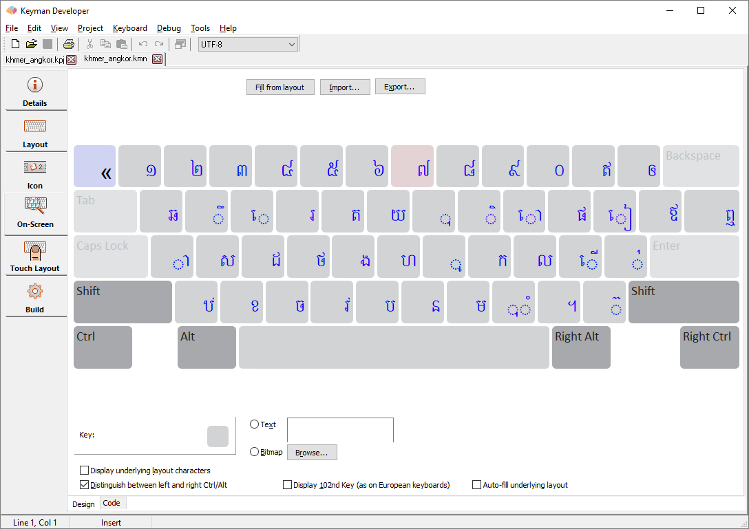
This tab allows you to edit the visual representation of your keyboard layout. The content on this tab is stored in the .kvks file associated with your keyboard. The visual representation is used only in desktop and desktop web; however if no touch layout is defined, this layout will be synthesized into a touch layout automatically.
An On-Screen keyboard is optional but in most keyboards is recommended. The On-Screen keyboard may not always match the actual layout identically, because you may choose to hide some of the details of encoding from the interface presented to the user. The user can also choose to print the layout.
This keyboard layout can also be printed or included in HTML or other documentation. The editor allows you to export the file to HTML, PNG or BMP formats.
- Fill from layout
- Compiles the keyboard file, and processes each possible keystroke in the keyboard file to automatically generate an On-Screen Keyboard that matches the layout. This can be used to effectively pre-populate the On-Screen Keyboard and reduces the complexity of designing it from scratch.
- Import
- Imports an On Screen Keyboard from an XML file.
- Export
- Exports the On Screen Keyboard to an XML file.
- Text
- The key cap for the selected key
- Bitmap
- A bitmap that is displayed on the selected key (not recommended, as it will not scale cleanly)
- Display underlying layout characters
- If checked, then the base or underlying layout will show in small letters at the top left of each key cap. This can be helpful to provide users with a guide as to the position of each key on the keyboard, especially for non-Latin scripts.
- Distinguish between left and right Ctrl/Alt
- If checked, treats the left and right Ctrl/Alt as separate layers
- Display 102nd Key (as on European keyboards)
- European keyboards have one extra key that is not on US keyboards. This key is positioned to the right of the left shift key. Some other keyboards have additional keys; these are not shown on the layout designer. If you have a European layout selected as your Windows layout, the 102nd key will always be visible in the designer; ensure you select this checkbox if you want the 102nd key to always be visible to end users of the layout, irrespective of their selected base layout. When a European layout is selected as your Windows layout, the shape of the Enter key will also change to take two rows, and the backslash key will move down one row, but not otherwise change in behaviour.
- Auto-fill underlying layout
- When the Fill from layout button is clicked, if this option is checked, then keys without corresponding rules in the Layout will be filled with the base layout character.
Touch Layout tab
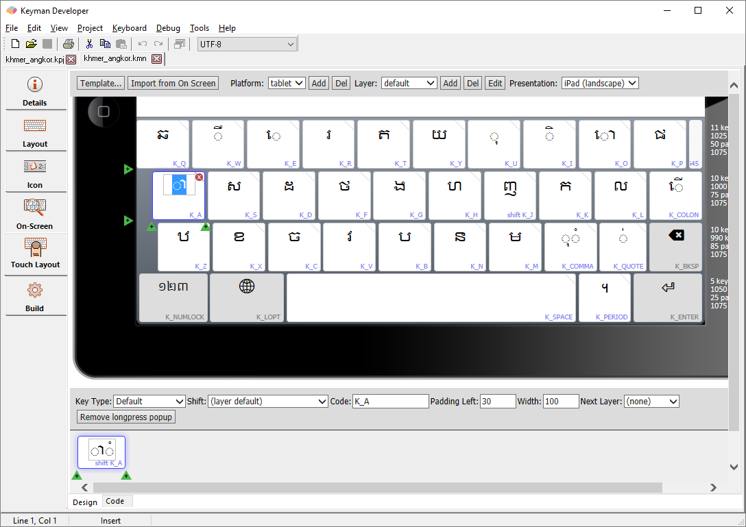
The Touch Layout tab is used to create the visible representation of the keyboard layout for touch devices. It works similarly to the On Screen Keyboard Editor conceptually, but
has a number of additional features specific to touch. Keys on the touch layout trigger rules within the normal Keyman keyboard; if no rule is defined for a given key, it will be
given output if it has a standard code beginning with K_, or if it is a Unicode value code, starting with U_.
Follow this guide for learning how to create a Touch Layout keyboard.
In Design view, the editor can show a number of different device types, including iPhone and iPad, in different orientations, to allow you to visualize the keyboard layout before you load it onto a device. The following image shows all aspects of the touch design view.
Top bar controls
- Template...
- The Template button allows you to choose a standard layout of keys from a predefined set. These layouts move the standard set of keys around and between layers to reduce the number of keys on each layer, optimising for mobile phone or other sizes. When Keyman Developer switches to a new template, it will transfer key definitions to the new layout as far as possible, but if keys on the current layout are not in the new template, their definitions will be lost. Therefore, selecting an appropriate template early in the development process is suggested.
- Import from On Screen
- If you have an existing On Screen Keyboard for your keyboard layout, importing the design from the On Screen Keyboard can reduce the development time considerably. Once you have imported, you will probably want to select a new template to transform the desktop-oriented design to a tablet or phone design automatically.
- Platform area
- The platform controls allow you to select and add or remove platform support for a given layout. If a platform is not defined, then Keyman Engine will transform the layout from another platform automatically, so you don't necessarily need to define layouts for each platform. If the 'Display underlying' checkbox is checked, then the base or underlying layout will show in small letters at the top left of each key cap. This can be helpful to provide users with a guide as to the position of each key on the keyboard, especially for non-Latin scripts.
- Layer area
- Each layout for each platform is made up of one or more layers of keys. Each layer can have a default shift state associated with it, which allows keys to trigger specific rules in the Layout code.
- Presentation
- This selector allows you to choose the simulated view of the keyboard, either landscape or portrait, for a number of devices. The presented keyboard may not be 100% identical to the final layout as seen on the device, but this allows you to get a feel for the design before testing.
Keyboard area
Under the top bar is the keyboard design area. This shows a device with a presentation of the key layout. Within the key layout, you can click on any key to edit it. There are a number of controls:
- Red circle with an X
- This button to the top right of the key will delete the key from the row; if it is the last key on the row, the entire row will be deleted.
- Green arrow with a +
- These buttons will insert a key to the left or right, or a single key on a new row above or below the selected key. Adding extra keys scales the entire keyboard.
- Dragging the right hand side of the key
- Dragging the right hand side of the key will resize the key; resizing the key will rescale the entire keyboard so it still fits within the device screen.
- Key Cap
- You can drop characters from Character Map directly into the key cap edit box, or type directly.
- Key Code
- Clicking on a key code on a key cap will focus the key code edit box instead of the key cap edit box.
- Drag and drop
- Keys can be moved around the keyboard by dragging them with the mouse; a ghost landing box will appear beneath the key when it can be dropped. If the key is dropped in an invalid area, no action will occur.
- Double-click
- Double clicking on a key with a "Next Layer" defined will switch to that layer.
- Top right slash
- A slash in the top right of a key indicates the presence of a long press menu for that key.
- Metrics
- The metrics displayed on the right hand side of the keyboard show the virtual width of each row of the keyboard, and the number of keys. For small devices, 10 keys is the maximum recommended number in a row; each key has a standard width of 100. While each row can be a different length, the last key in the row will be stretched to balance the final design; 'spacer' keys can be used to leave a visual gap on the right hand side of the keyboard. You should aim to make each row the same total width for consistent results.
Middle bar controls
Below the keyboard area is another control bar for editing details of the selected key.
- Key Type
The general appearance of each key is determined by the key type, which is selected (in Keyman Developer 10) from a drop-down list:
Key Type Description Default (normal) key A standard letter or character key on the keyboard Special (shift) key The grey control type keys, layer shifts, Enter, Backspace, etc. Active special key A variation on the Special keys, which shows a highlight, typically used to indicate that a shift key for example is down. Dead-key While this key type has no difference in function to default keys, it will have a different style to indicate that it is different; the logic in the keyboard source may well be a deadkey, for example. Blank key This type of key cannot be selected in use and shows as a blank key. Spacer Leaves a space in the keyboard at the point it is inserted, in the background colour of the keyboard area. - Shift
- Determines the shift state that Keyman Engine will receive from the key stroke, such as Shift or Ctrl. This makes it simpler to design a single keyboard that works across both desktop and mobile interfaces.
- Code
Each key must be given an identifying key code which is unique to the key layer. Key codes by and large correspond to the virtual key codes used when creating a keyboard program for a desktop keyboard, and should start with
K_, for keys mapped to standard Keyman virtual key names, e.g.K_HYPHEN, andT_orU_for user-defined names, e.g.T_ZZZ. If keyboard rules exist matching the key code in context, then the output from the key will be determined by the processing of those rules. It is usually best to include explicit rules to manage the output from each key, but if no rules matching the key code are included in the keyboard program, and the key code matches the patternU_xxxx[_yyyy...](wherexxxxandyyyyare 4 to 6-digit hex strings), then the Unicode charactersU+xxxxandU+yyyywill be output. As of Keyman 15, you can use more than one Unicode character value in the id (earlier versions permitted only one). The key code is always required, and a default code will usually be generated automatically by Keyman Developer.K_xxxxis used for a standard Keyman Desktop key name, e.g.K_W,K_ENTER. You cannot make up your ownK_xxxxnames. Many of theK_ids have overloaded output behaviour, for instance, if no rule is matched forK_W, Keyman will output 'w' when it is touched. The standard key names are listed in Virtual Keys and Virtual Character Keys. Typically, you would use only the "common" virtual key codes.T_xxxxis used for any user defined names, e.g.T_SCHWA. If you wanted to use it,T_ENTERwould also be valid. If no rule matches it, the key will have no output behaviour.U_####[_####]is used as a shortcut for a key that will output those Unicode values, if no rule matches it. This is similar to the overloaded behaviour forK_ids. Thus####must be valid Unicode characters. E.g.U_0259would generate a schwa if no rule matches. It is still valid to have a rule such as+ [U_0259] > ...
- Padding Left
- Padding to the left of each key can be adjusted, and specified as a percentage of the default key width (100). If not specified, a standard padding of 5% of the key width is used between adjacent keys.
- Width
- The layout is scaled to fit the widest row of keys in the device width, assuming a default key width of 100 units. Keys that are to be wider or narrower than the default width should have width specified as a percentage of the default width. For any key row that is narrower than the widest row, the width of the last key in the row will be automatically increased to align the right hand side of the key with the key with the right edge of the keyboard. However, where this is not wanted, a "spacer" key can be inserted to leave a visible space instead. As shown in the above layouts, where the spacer key appears on the designer screen as a narrow key, but will not be visible in actual use.
- Next Layer
- The virtual keys
K_SHIFT,K_CONTROL,K_MENU, etc. are normally used to switch to another key layer, which is implied by the key code. The left and right variants of those key codes, and also additional layer-switching keys mentioned above (K_NUMERALS,K_SYMBOLS,K_CURRENCIES,K_ALTGR) can also be used to automatically switch to the appropriate key layer instead of outputting a character. However, it is sometimes useful for a key to output a character first, then switch to a new layer, for example, switching back to the default keyboard layer after a punctuation key on a secondary layer had been used. Specifying thenextlayerfor a key allows a different key layer to be selected automatically following the output of the key. Of course, that can be manually overridden by switching to a different layer if preferred. - Add/Remove long press popup
- Adds or removes the long press menu from the selected key.
Long press area
The keys in the long press area cannot be resized but the controls otherwise work the same as in the main keyboard area. The keys cannot be dragged between the main keyboard area and the long press area. The bar below the long press area contains the corresponding controls for the long press keys.
The Code view allows you to edit the JSON source of the touch layout file. This makes certain operations simpler, such as batched rearranging of keys, or using another text editor to make bulk changes. The Code view uses the standard editor.
The format of the layout file is described in Creating a touch keyboard layout guide.
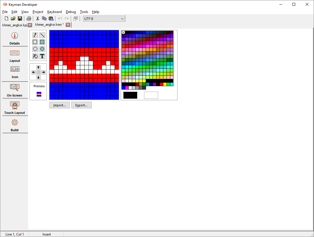
Icon tab
The icon tab allows you to edit the icon associated with the keyboard. An external icon editor will allow you to create more sophisticated icons with alpha transparency and multiple resolutions, but this will cover the standard 16x16 256 colour icon which is all that many keyboards require. The controls at the top left are:
- Pencil
- Freehand drawing with the selected colour; use right mouse button for secondary colour.
- Line
- Draw a straight line
- Open box
- Draw an outline box
- Filled box
- Draw a filled box in current colour
- Open circle
- Draw an outline circle or ellipse
- Filled circle
- Draw a filled circle or ellipse in the current colour
- Fill
- Fill from the current point all contiguous pixels of the same colour
- Text
- Use this tool to add a letter or letters to the icon. Click in the lower left of the icon area and a window opens where you can type the text you want. You can also change the quality of the font as well as the font properties by clicking on the Change button. Note that to change the color of the font, you need to change the color setting in the font properties window.
The icon can be exported or imported to/from various other formats. The transparent colour is the top left colour in the grid with an X in the box. The icon can be rotated in any direction with the arrow controls below the toolbox; this will not lose data from the icon but will instead rotate the edge moving off the grid to the other side of the grid.
Embedded JS tab
This tab allows you to edit JavaScript code in the file referenced by the &kmw_embedjs store, implementing IMX functionality of the keyboard.
Embedded CSS tab
This tab allows you to edit the Cascading Style Sheet rules in the file referenced by the &kmw_embedcss store for the keyboard.
Web Help tab
This tab allows you to add a custom HTML snippet to replace the desktop on screen keyboard, for example useful if the keyboard uses sequences of keys to produce characters.
Include Codes tab
This tab allows you to edit the named constants for the keyboard.
Build tab
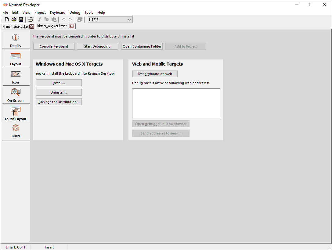
A set of common controls is across the top of this tab:
- Compile Keyboard
- You can compile the keyboard for testing and installation by clicking the button, or selecting Keyboard, Compile Keyboard. This will compile the keyboard for all the selected Targets from the Details tab.
- Start Debugging
- To test your keyboard within Keyman Developer, press F5 to start the debugger, or press the Start Debugging button. This is suitable for testing desktop layouts.
- Open Containing Folder
- Opens the folder which contains the keyboard source files.
- Add to Project
- If the keyboard file is not already part of the project, adds it to the project.
Windows and macOS Targets
If your keyboard is designed to target Windows and macOS, then the following buttons will also be visible:
- Install
- Installs the keyboard for use with Keyman Desktop on your computer
- Uninstall
- Uninstalls the keyboard from Keyman Desktop if previously installed
- Package for Distribution
- Creates a package file to prepare distribution of the keyboard
Web and Mobile Targets
If your keyboard is designed to target KeymanWeb, mobile or tablet devices, the following controls will also be visible:
- Test Keyboard on Web
- Starts the Keyman Developer Web Server for the current keyboard.
- Addresses
- Lists the various IP addresses and hostnames that Keyman Developer is listening on
- Open debugger in local browser
- Starts your default browser with the selected address to allow testing of the keyboard directly
- Send addresses to email
- Sends the list of web addresses as an email so that you can more easily open the test site on your mobile device, or share with someone else on your network.
To test on other platforms, open one of the debug host addresses listed on your device. Your device will need to be on the same network as the Keyman Developer computer.
You can test within the web browser on your device, or in the native app if you have it installed: just click the Install button on the debugger web page.
The Send to email function makes it easier to open the addresses on your mobile device without having to enter them manually.
Learn more about testing on the web and mobile devices.